Saturday, April 30, 2011

Logo Designers Share their Process

The article "The Logo Design Process of Top Logo Designers" at http://justcreativedesign.com/2008/02/01/logo-design-process-of-top-graphic-designers/ summarizes the secret logo design process that 75 top designers told Leslie Cabarga in his book "The Secret Life of Logos: Behind the Scenes with Top Designers."

Below is a synopsis taken from the website of the 8 steps applied by the designers. I've bookmarked the site and plan on reflecting on these steps the next time I'm given a logo design project.


  1. Design Brief: Conduct Questionnaire or Interview with client to get the design brief.
  2. Research: Conduct research focused on the industry itself, on its history, and on its competitors.
  3. Reference: Conduct research into logo designs that have been successful and current styles and trends that are related to the design brief.
  4. Sketching & Conceptualising: Develop the logo design concept(s) around the brief and research. Use creativity. Know how to design a logo.
  5. Reflection: Take breaks throughout the design process. This lets your ideas mature and for you to get renewed enthusiasm. Receive feedback.
  6. Positioning: Position yourself as a contractor or build a long lasting relationship. ie. Client orders you what to do OR You guide client to the best solution.
  7. Presentation: Choose to present only a select few logos to the client or a whole collection.
  8. Celebration: Drink beer, eat chocolate, sleep, start on next logo design. Or a combination. 

What I like about Soho Paper's Website


I love paper and whenever I need to buy specialty paper, envelopes and related products I go to Soho Paper's website. The layout of the site is easy to navigate. All of the menus with products are at the top of each page and each main menu has a drop down menu which allows you to be more selective in your choices. Menus dealing with administrative needs, ie terms and conditions, contact info etc... are all at the bottom of each page.

Once you select the item you want, i.e. A6 envelope, you immediately get a visual of all the A6 envelopes they offer. The envelopes are grouped by paper type and each paper type has thumbnails of the colors available. Scroll bars keep all of the A6 envelopes on the same page.

Once you find an item you want, checkout is easy. You select the item (which takes you to a new screen). At the next screen, a detailed description of your selection is provided with an option to add the item to your fax sheet. After you've added all of the items you want, a menu at the bottom takes you to the fax sheet with all of the items you've selected. On this screen, you can remove an item or keep shopping if you're not done.


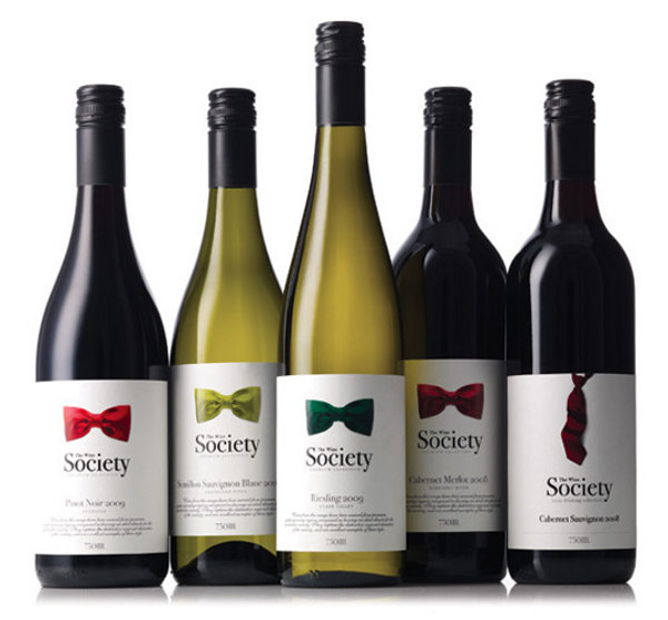
The picture on the label tells the story on the wines society's bottles.   The bowties represent premium and fine vintages, whereas the loose necktie marks the value/less expensive wines.

Ciao Bella's Packaging Redesign

Before
After


Cia Bella's Packaging Redesign is smart. They've retained the vibrant colors of their line but have added to the design in a way that is more functional and inviting. Pictures of the actual product are now featured on the front and the flavor is on a contrasting background which makes it more visible.

Saturday, March 12, 2011

Sex Sells


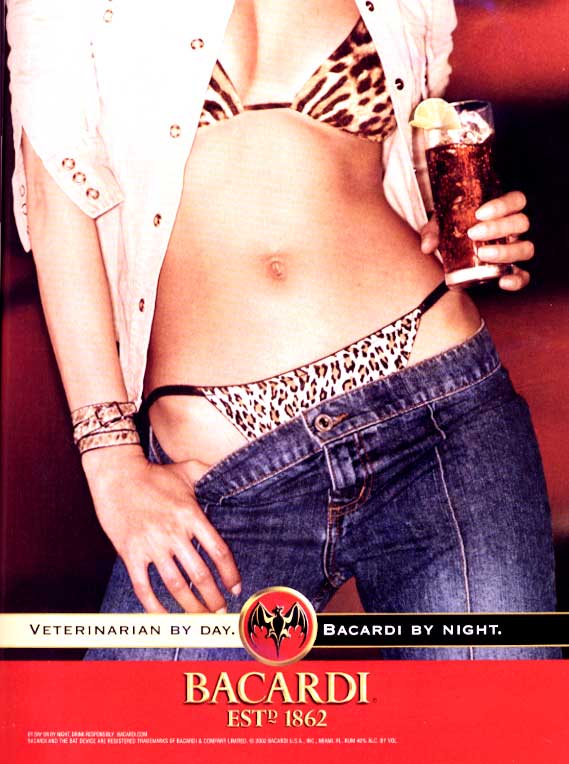
Bacardi is selling sex and attitude in this ad. "Vet by day and Bacardi by night" is a call to all professionals who know how to work hard and play hard.

Saturday, March 5, 2011

Amnesty International's Postcard


The design of Amnesty International's postcard is just ok, but it is their approach to marketing that makes the card brilliant.  

The postcard is a call to action for activists to send a letter to the White House regarding the plight in Gaza. Rather than take chances that the wrong message is sent, Amnesty International crafted the message, designed and laid out the card, and posted it to their website at http://www.amnestyusa.org/pdf/gazapostcard2010.pdf. Activists just need to download, print and mail the card to the White House. 


Saturday, February 19, 2011

Aids Awareness Campaign


This campaign was the first in American Advertising to use the word "condom" 

The message is strong and gets right to the heart of the matter. It acknowledges the problem/s: (not wanting to use a condom and acquiring AIDS) and suggests a benefit to using a condom: (life).
AIDS Historic print